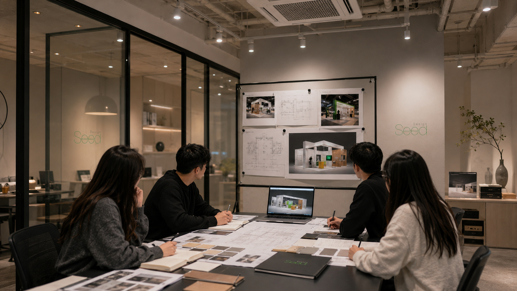
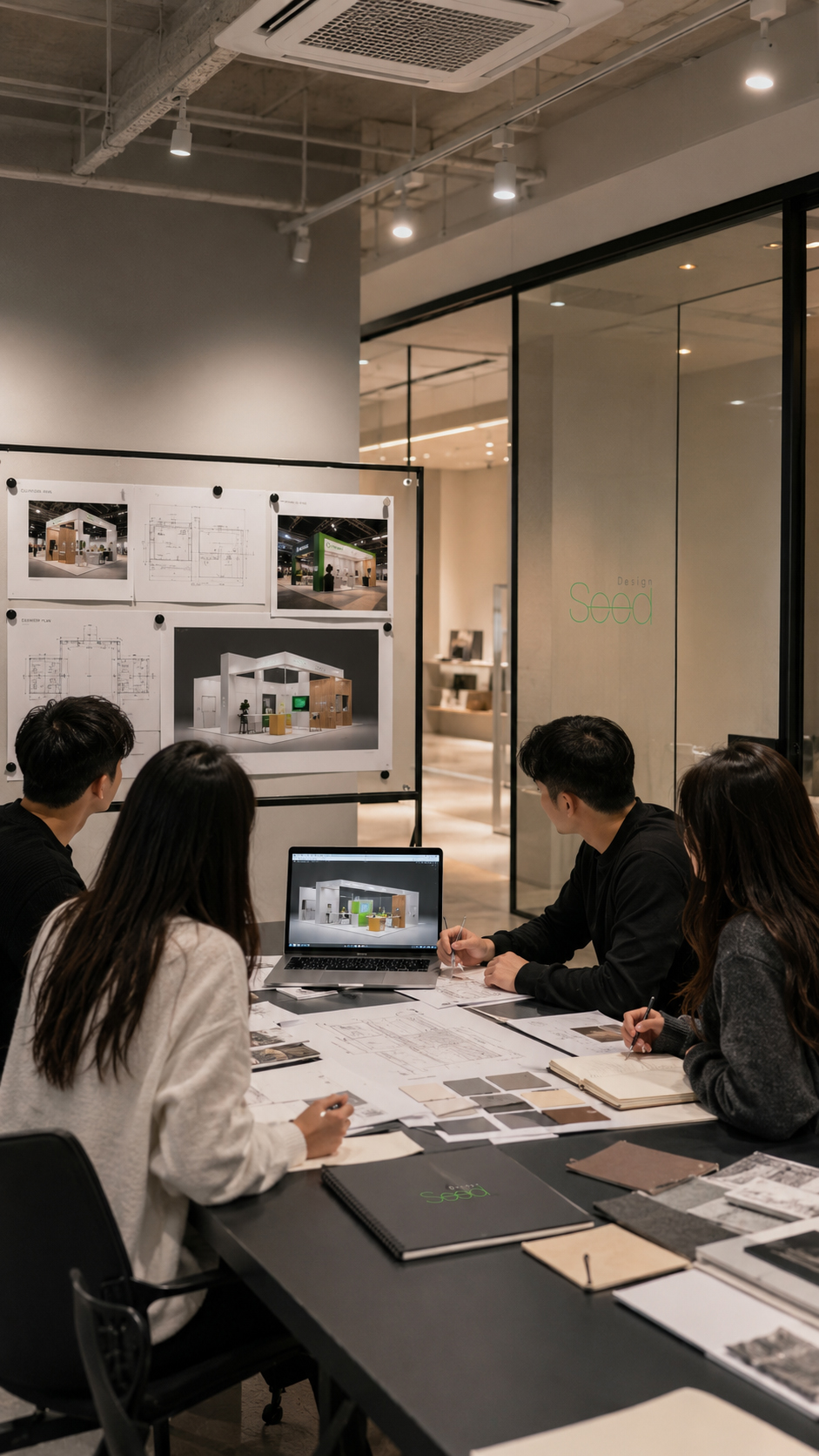
국제안전보건전시회 전시부스 디자인·시공 사례 | 부스 제작
Safety & Health Exhibition Booth Design and Construction Case
이번 프로젝트는 킨텍스에서 개최되는 국제안전보건전시회에 참가한 클렌즈와 Dr.MED SAFETY 전시부스 디자인·제작·시공 사례입니다.
산업안전, 산업보건, 보호구, 워크웨어, 스마트안전 등 안전보건 산업 분야의 전시 특성에 맞춰, 각 브랜드의 제품 이미지와 공간 콘셉트가 명확하게 전달될 수 있도록 구성했습니다.
클렌즈 부스는 목공 구조를 기반으로 도배 마감과 라인조명을 적용해 깨끗하고 전문적인 브랜드 이미지를 강조했습니다.
화이트와 블루 컬러를 중심으로 신뢰감 있는 분위기를 만들고, 제품 진열 벽면과 상담 공간이 자연스럽게 연결되도록 계획했습니다.
Dr.MED SAFETY 부스는 아시바 시스템 구조를 활용해 실제 공사현장을 연상시키는 콘셉트로 제작했습니다.
옐로우와 블랙 컬러, 메쉬 구조, 작업 현장 그래픽을 조합하여 안전용품 브랜드의 강한 아이덴티티와 현장감을 직관적으로 표현했습니다.
This project showcases the exhibition booth design and construction case for Klienz and Dr.MED SAFETY at the Korea International Safety & Health Show.
Reflecting the characteristics of the safety and health industry, including industrial safety, occupational health, protective equipment, workwear, and smart safety, each booth was designed to clearly communicate the brand’s product identity and spatial concept.
The Klienz booth was built with a wooden structure, wallpaper finishing, and linear lighting to create a clean and professional brand image.
White and blue colors were used to create a reliable atmosphere, while the product display walls and consultation areas were arranged to support a natural visitor flow.
The Dr.MED SAFETY booth was designed with a scaffold system structure, creating a construction-site-inspired exhibition space.
Yellow and black colors, mesh structures, and worksite-style graphics were combined to clearly express the strong identity and realistic character of the safety product brand.
클렌즈 부스는 목공 구조를 기반으로 제작되었습니다.
현장에서는 먼저 벽체와 상부 사인 구조, 제품 진열 선반, 상담 공간의 위치를 도면 기준으로 잡고 전체 골조를 세웠습니다.
목공 부스는 브랜드 목적에 맞춰 벽면 구성, 선반 깊이, 조명 위치, 카운터 형태 등을 세밀하게 조정할 수 있어 완성도 높은 맞춤형 전시 공간을 만들 수 있습니다.
The Klienz booth was built with a custom wooden structure.
On site, the wall structures, upper signage frame, product display shelves, and consultation areas were first positioned according to the drawings.
A wooden booth allows detailed adjustments in wall composition, shelf depth, lighting position, and counter layout, creating a highly customized exhibition space.
목공 구조 시공 후에는 전체 벽면을 도배 마감으로 정리했습니다.
화이트 외부 프레임과 블루 컬러의 내부 벽면이 깔끔하게 연결되도록 마감선을 확인했으며, 제품 진열 벽면은 패키지가 돋보일 수 있도록 평활도와 마감 품질을 세심하게 점검했습니다.
도배 마감은 부스 전체에 깨끗하고 정돈된 이미지를 주며, 브랜드의 신뢰감과 전문성을 표현하는 데 중요한 역할을 했습니다.
After the wooden structure was completed, the wall surfaces were finished with wallpaper.
The finishing lines between the white exterior frame and the blue interior walls were carefully checked to create a clean connection.
The product display walls were also inspected for surface quality so that the displayed products could stand out clearly.
The wallpaper finish gave the booth a clean and organized impression, helping express the brand’s reliability and professionalism.
부스 내부에는 라인조명을 적용해 공간의 방향성과 깊이감을 강조했습니다.
천장부에 배치된 라인조명은 방문객의 시선을 자연스럽게 안쪽 제품 진열 벽면으로 유도하며, 블루 컬러 벽면과 함께 강한 브랜드 이미지를 형성했습니다.
또한 상부 사인 조명과 벽면 조명을 함께 구성해 전시장 안에서도 부스가 밝고 선명하게 보이도록 계획했습니다.
Linear lighting was applied inside the booth to emphasize direction and depth.
The ceiling line lights naturally guided visitors’ attention toward the product display walls and created a strong brand impression together with the blue interior walls.
Upper signage lighting and wall lighting were also applied so that the booth could stand out clearly within the exhibition hall.
상부에는 대형 Klienz 로고 사인을 설치해 멀리서도 브랜드가 쉽게 인지되도록 했습니다.
내부 벽면에는 제품 설명 그래픽과 카테고리 정보를 정리해 방문객이 제품 특성을 빠르게 이해할 수 있도록 구성했습니다.
사인과 그래픽은 단순한 장식 요소가 아니라, 브랜드 인지도와 제품 전달력을 높이는 핵심 요소로 계획되었습니다.
A large Klienz logo sign was installed at the upper front area to ensure strong brand visibility from a distance.
Product information graphics and category details were arranged on the interior walls so that visitors could quickly understand the product features.
The signage and graphics were planned not only as decorative elements, but also as key tools for brand recognition and product communication.
제품 진열 벽면은 카테고리별로 구분해 구성했으며, 작은 패키지 제품도 한눈에 잘 보이도록 선반 간격과 조명 밝기를 조정했습니다.
상담 테이블은 방문객 동선을 방해하지 않는 위치에 배치하여 제품 확인 후 자연스럽게 상담으로 이어질 수 있도록 했습니다.
클렌즈 부스는 제품 전시, 브랜드 홍보, 상담 기능이 함께 작동하는 실용적인 전시 공간으로 완성되었습니다.
The product display walls were organized by category, and the shelf spacing and lighting brightness were adjusted so that even small packaged products could be clearly visible.
The consultation tables were placed in positions that did not interrupt visitor flow, allowing visitors to move naturally from product viewing to business discussion.
The Klienz booth was completed as a practical exhibition space that combined product display, brand promotion, and consultation functions.
Dr.MED SAFETY 부스는 공사 현장의 분위기를 전시 공간 안에 표현하는 것을 핵심 콘셉트로 진행했습니다.
시공 초기에는 부스 위치를 기준으로 바닥 영역을 잡고, 브랜드 컬러인 옐로우를 강하게 적용해 작업 현장 같은 첫인상을 만들었습니다.
노란 바닥과 블랙 포인트는 안전용품 브랜드의 이미지를 직관적으로 전달하는 요소로 사용되었습니다.
The Dr.MED SAFETY booth was designed around the concept of expressing a construction site atmosphere within the exhibition space.
At the early stage of construction, the booth area was marked out and the brand’s strong yellow color was applied to the floor to create a worksite-inspired first impression.
The yellow floor and black accents were used to directly communicate the identity of a safety product brand.
부스 구조는 아시바 시스템을 활용해 제작되었습니다.
기존의 일반적인 목공 벽체가 아닌 철제 아시바 구조를 사용하여 실제 공사 현장에 가까운 분위기를 만들었고, 브랜드가 전달하고자 하는 안전·보호·작업 환경의 이미지를 공간적으로 표현했습니다.
아시바 구조는 부스의 콘셉트를 가장 명확하게 보여주는 핵심 요소로, 제품 진열과 그래픽 설치의 프레임 역할도 함께 수행했습니다.
The booth structure was built using a scaffold system.
Instead of using a standard wooden wall structure, the metal scaffold system created an atmosphere closer to an actual construction site.
This structure visually expressed the brand’s message of safety, protection, and working environments.
The scaffold system became the key element of the booth concept while also functioning as a frame for product display and graphic installation.
아시바 구조 위에는 메쉬와 패널, 브랜드 그래픽을 조합해 산업적인 분위기를 강화했습니다.
벽면에는 Dr.MED SAFETY 로고와 “WORKER’S SAFETY” 메시지를 크게 적용해 브랜드 성격이 즉각적으로 전달되도록 했습니다.
공사 현장의 안전 표지, 작업 구역, 보호 장비 이미지를 연상시키는 그래픽 요소를 사용해 부스 전체가 하나의 콘셉트 공간으로 보이도록 구성했습니다.
Mesh panels, wall panels, and brand graphics were combined with the scaffold structure to strengthen the industrial mood.
The Dr.MED SAFETY logo and “WORKER’S SAFETY” message were applied prominently on the wall to communicate the brand identity immediately.
Graphic elements inspired by safety signs, work zones, and protective equipment helped the entire booth appear as one consistent concept space.
#국제안전보건전시회 #안전보건전시회 #KISS2025 #전시부스디자인 #전시부스시공 #부스제작 #디자인시드 #크렌즈 #Klenz #닥터메드 #DrMEDSAFETY #안전용품부스 #보호구전시 #산업안전전시회 #산업보건전시회 #목공부스 #도배마감부스 #라인조명부스 #아시바부스 #공사현장컨셉부스
전시부스 디자인 & 시공
디자인시드는 브랜드의 목적과 전시 환경에 맞춘 전시부스 디자인과 시공을 진행합니다. 목공부스, 기업부스, 홍보부스, 브랜드 체험공간까지 기획부터 제작, 현장 설치까지 함께합니다.
깔끔한 마감, 효율적인 동선, 조명 디테일, 그리고 브랜드가 잘 보이는 공간 구성을 중요하게 생각합니다. 전시장의 조건과 관람객 흐름에 맞춰 완성도 높은 전시공간을 만들어드립니다.
- +전시부스 디자인
- +목공부스 시공
- +기업부스 디자인
- +홍보부스 제작
- +조명·사인 연출
- +현장 설치
